In 2025–2026, the biggest threat to your digital growth is not “no website” — it is a static brochure site that looks fine but does nothing measurable for revenue. Many businesses still treat their website as a digital visiting card when it should be the engine that powers awareness, lead generation, and sales.
Brochure Site vs Funnel-Based Architecture
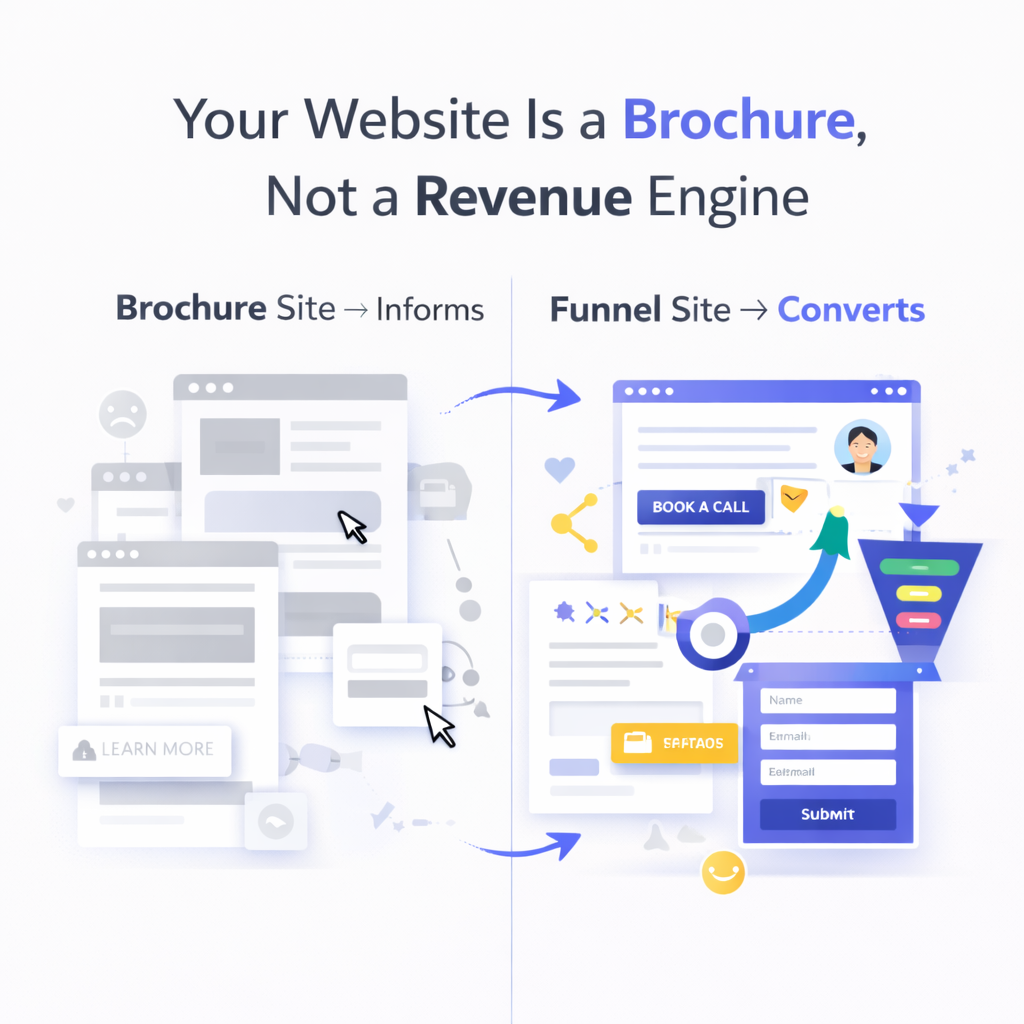
A traditional brochure site is built around pages, not journeys.
It usually has:
Generic “Home, About, Services, Contact” navigation
Informational content with no clear next step
Little to no tracking of what visitors actually do
These sites rarely produce reliable leads because they are not designed to guide a visitor from problem awareness to action. They exist, but they do not sell.
A funnel-based architecture, in contrast, is built around a sequence of steps and decisions.
Key traits include:
Each page or section has a specific purpose (educate, qualify, convert)
Distractions are reduced and calls-to-action are clear and consistent
The journey is intentionally mapped: landing page → value and proof → offer → form or checkout
Industry analyses consistently show that focused funnel flows convert a higher percentage of visitors than generic multi-page sites, because people are not left to “figure it out” on their own. Instead, the structure does the guiding, making it easier for serious prospects to move forward.
The Role of UX Flows, CTAs, and Content Hierarchy in Lead Generation
Once a website is treated as a system rather than a static asset, UX becomes a commercial lever, not just a visual one.
Three elements matter most:
UX Flows
A UX flow is the path a user takes from entry point to outcome. On a brochure site, this path is accidental. On a revenue-focused site, it is designed.
Visitors arriving from search or social land on pages that match their intent
Information is revealed in a logical order (problem, solution, proof, next step)
Dead ends are removed; every key section offers a way to continue
CTAs (Calls-to-Action)
CTA placement, wording, and frequency heavily influence how many visitors convert.
Primary CTAs (Book a Call, Request a Quote, Start Free Demo) guide high-intent users
Secondary CTAs (Download a guide, Join a mailing list, View pricing) capture those who are not ready yet
CTAs are repeated strategically in long pages so users never have to scroll back to act
Content Hierarchy
Content hierarchy is how information is prioritized visually and structurally.
Headlines quickly answer: “Who is this for?” and “What problem do they solve?”
Subheads and sections lead users deeper based on interest (industries served, outcomes, process, proof)
Visual emphasis (typography, spacing, contrast) ensures the most important messages and proof elements stand out
When these three work together, a website stops being a passive repository of information and becomes an active lead-generation funnel. The same traffic suddenly produces more form fills, qualified inquiries, and sales conversations.
How AzxMatrix Structures Sites as Systems, Not Static Assets
AzxMatrix, a website development company in Mumbai with global delivery across the US and UAE, approaches website development with the assumption that every page must justify its place in the revenue system.
1. Strategy Before Screens
Projects do not start with design files; they start with questions:
Who are the primary audience segments in India, the US, and the UAE?
What are the 1–2 highest-value actions visitors can take (per region or segment)?
Which objections and questions block those actions today?
From these answers, AzxMatrix defines funnels — not just pages — for key objectives such as lead generation, product discovery, booking, or consultation.
2. Funnel-Based Information Architecture
Instead of a flat list of pages, information architecture is built around user journeys. For example:
Paid or social traffic → focused landing page → social proof & offer → lead capture
Organic traffic → educational content or service page → relevant case studies → CTA
Returning users → comparison/pricing page → FAQ → booking or contact
Each path is mapped for clarity, reducing friction and confusion. Navigation, internal links, and page layouts all follow this logic.
3. UX and CTA Design That Supports Decisions
Design decisions are driven by how people make decisions, not just how the site looks in a screenshot. AzxMatrix emphasizes:
Clear, benefit-driven headlines instead of vague taglines
Short, layered sections where each scroll reveals a new piece of the story (problem, solution, proof, next step)
CTAs that match buyer stage (e.g., “Talk to an expert” for B2B, “Try it now” for e-commerce, “Book appointment” for clinics)
This approach works particularly well in markets like the US and UAE where users expect speed, clarity, and professional presentation, as well as in India where mobile-first behavior and quick scanning dominate.
4. Measurement and Iteration Built In
A system mindset means the website is never considered “done” at launch. AzxMatrix typically:
Sets up analytics and event tracking around key funnel steps (clicks on CTAs, form starts, drop-offs)
Monitors which pages and sections contribute most to lead generation
Iterates copy, layout, and CTAs based on actual behavior, not assumptions
This closes the loop between design, UX, and business outcomes, turning the website into an evolving asset rather than a one-time project.
From Static Presence to Revenue Infrastructure
In 2025–2026, the businesses that win online will be those that treat their websites as living revenue systems instead of static brochure sites. A “nice-looking” homepage is not enough if it does not intentionally guide visitors toward meaningful actions.
The shift is simple but powerful:
From “What pages do we need?” to “What journeys do our best customers take?”
From “Does this look good?” to “Does this move people closer to a call, demo, or purchase?”
From “We launched the site” to “We are continuously improving the system.”
AzxMatrix builds with this mindset from day one, using UX flows, CTAs, and content hierarchy as levers to align design with growth. For founders, marketers, and leadership teams in India, the US, and the UAE, rethinking the website as a revenue engine, not a brochure, is one of the most important strategic upgrades to make over the next 12–18 months.